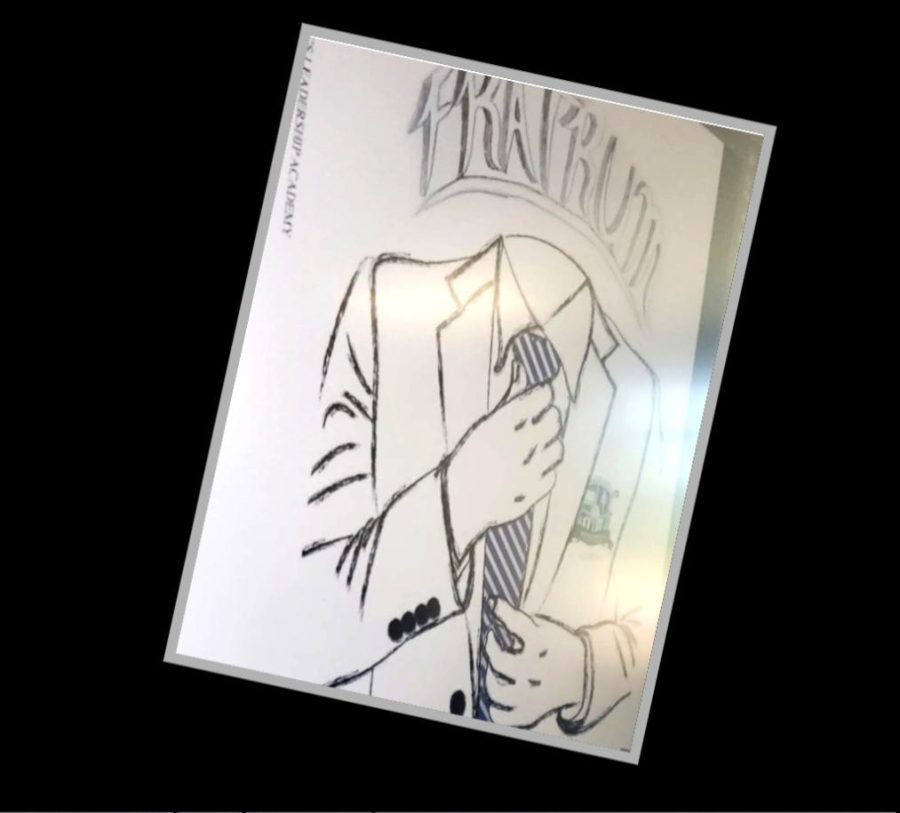
The idea for the cover of the yearbook was developed within the mindset of establishing the tone, feeling of the young men, and their journey to be great. For the figure to not have a face was a conscious decision made by the creative team to connect the vis
ion that anyone can wear the suit and be successful. The colors of the yearbook cover was an aesthetic choice supported by the entire journalism staff. We chose the color black for the suit to invoke the sense of the growth and maturity the young men have developed over the years. The background of the cover was chosen to be white for the symbolism of a blank canvas our that young men can make their own in the world after graduation. The title of our yearbook is Fratrum, which is a latin word which means “meeting of the brothers”, a word of which applies to every brother at he YMLA given our morning tradition.